Design Showcase: Diane Benjamin
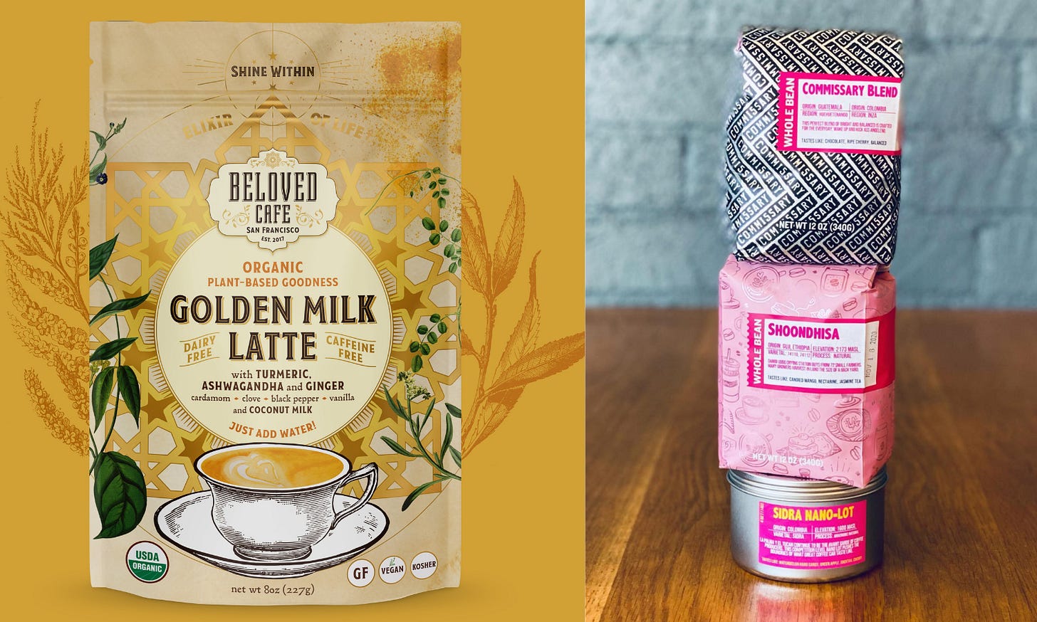
Featuring the packages for Beloved, Sinister Coffee, Viking Remedy & Reggie's Roast printed by Roastar.

Who: Diane Benjamin (She/Her)
Role: Freelance Designer
Where: Short Hills, NJ
Connect: www.dianebenjamindesign.com • @benjamin_diane
What they order: I mostly just have coffee at home. If I’m out and I get coffee, I keep it simple. Just coffee and milk.
Any favorite roasters/coffee shops you'd like to shout out: It’s always a treat to get coffee from Café du Monde in New Orleans.
R!WC: Diane, thanks for chatting with us at Roast! West Coast. I'm excited to learn more about your design work, but first, I'd like to ask about you! Who are you?
Diane: I’ve always been creative and have always loved to draw and paint. I was not allowed to go to art school straight out of high school the way I wanted to, so I went to college and studied literature. I had a great time and learned to think critically and to write well. As a result, I can help clients with copywriting if needed.
I love travel. I love seeing other parts of the world and how people live in other places. It’s great to get outside the US and see other perspectives. I love to walk around in supermarkets in other countries or in ethnic markets in the US.
I look for beauty in everything, and that really sustains me. It keeps me happy.

R!WC: What inspired you to pursue a career in design? To follow up, how did you get started specifically in packaging design?
Diane: After college, I moved to San Francisco. I signed up for some design classes at California College of Art. The first of these was Package Design. The first assignment was to design packaging for a line of tea. How I loved that project! I became obsessed and designed patterns for each type of tea, made comps with special Japanese paper, and a slider that would fit over each box. It was very elaborate. I realized graphic design, and especially packaging, was what I wanted to do all day, every day. I ended up moving to New York to go to Parsons School of Design full-time.
R!WC: As a creative person, was it easier or harder to create a brand identity for yourself?
Diane: Easier, because I only have to please myself. I have creative freedom, and no one else is telling me what to do. The worst is when clients show work around and get all kinds of feedback and then expect me to incorporate all of it. It does not lead to the best work.
R!WC: What makes for a good designer/client relationship?
Diane: Although I like creative freedom, the fact is, I am designing for my clients. Each client has a different product line and a different mission, and it is my job to express whatever that is to consumers. It is not about me -- it is about the product. In order to communicate visually about the product, I have to understand it, so communication with the client is very important. Clarity is important. Meeting deadlines is important. Mutual respect is important. I very much appreciate clients who pay in a timely manner.
R!WC: What is your strategy or philosophy when brainstorming the design concept for a new package? What are the challenges? What is the fun part?
Diane: My philosophy is – don’t be inhibited. Try everything and say everything because even if one idea is cheesy or silly, it may lead to another idea that’s good. So I tell my clients, don’t be afraid to say what comes into your head, and I won’t be either. I may give you an idea, or you may give me one.
I sketch and come up with as many ideas as I can, and then I choose the most viable ones to show the client. I refine the one they like the best.
I think all of it is fun. I tell clients this is the fun part. Enjoy the process. Business owners have all sorts of other things to worry about – payroll, shipping, sales, legal issues—design is the fun part.
R!WC: What makes for a good coffee package design? Why do some packages stand out on the shelf?
Diane: Sometimes, the quieter packages actually stand out more when everything else around them is busy—like an oasis of calm. It’s useful to look at store shelves and even make an image in Photoshop to which you add your bags to compare them. It’s called a planogram. It’s a way to visualize the product with competitors’ products in advance.

R!WC: You have a long client list in the food, beverage, and hospitality packaged goods industries. How does good design add value to these types of businesses?
Diane: I can help you sell your product. I can get it in the door, and I can get the customer to pick it up and buy it – once. The rest is up to the quality of the product.
R!WC: I noticed a lot of hand-drawn elements in your work, and you detail the progression of a sketch to a finished design on your website. What does your relationship to drawing and/or manually created designs mean to you?
Diane: There has been a big movement towards organic products, products with fewer additives and preservatives, and small-batch products. Part of the reason I draw by hand is to get a human feeling on the bag, which helps communicate that the product is healthy, organic,[and has] simple ingredients—not loaded with chemicals or mass produced.
Another reason is just that I’m better at drawing with a pen or pencil. I have a stylus, but I still haven’t used it. I like to print out the design that I’m working on and get in there with a pencil, then scan it. It just comes out better.
Also, I like for clients to understand what goes into the work I do.
R!WC: What questions should a client ask of a potential designer/design firm before hiring them?
Diane: Be sure you have seen and like the designer or company’s work. I was stunned once when a client admitted she had not looked at my portfolio. You must look at the portfolio! Make sure the designer has done work that is in line stylistically with what you want. It doesn’t have to be that they’ve done a lot of coffee (or whatever your product is). It’s more about the feeling they are conveying. Can they convey the feeling you want?
The timeframe is important. How long will this process take? Clients plan a launch, and the product and collateral will have to be ready.
The client will be concerned about [the] budget. So that frank discussion must take place. I always give clients an estimate after I understand what they need. I report on my time as I go, and if it’s a long project, I will ask for milestone payments. Don’t be shy about this topic.

R!WC: Is there anything else we didn't cover that listeners should know about you and/or your design company?
Diane: Nothing pleases me more than doing a good job and adding a beautiful project to my portfolio. I’m on your side about having it come out as well as possible.
R!WC: I’ll close out with, do you have a favorite holiday movie? If yes, which one and why?
Diane: My favorite holiday is Halloween, so I’m going with “The Nightmare Before Christmas.” I like the songs, and I like Tim Burton. Maybe I should have said that above! “I’m a goth at heart! Please give me dark projects!”
FONTS:
Gotham font is available at typeography.com. It was designed by type designer Tobias Frere-Jones with Jesse Ragan. It has been out in the market since 2000. It was originally commissioned by GQ magazine and has famously been used on the cornerstone for the Freedom Tower in New York City, in the 2008 Obama Presidential campaign, and in the opening credits of Saturday Night Live. Learn more about Gotham font and where it has been.
CHECK OUT THESE R!WC INDUSTRY PARTNERS
Roastar • Zumbar Coffee & Tea • First Light Coffee Whiskey • Steady State Roasting • Mostra Coffee • Coffee Cycle • Camp Coffee Company • Ignite Coffee Company • Ascend Coffee Roasters • Marea Coffee • Cape Horn Coffee Roasters • Hacea Coffee Source • Crossings Coffee • Acento Coffee • Sivitz Roasting Machines
Thank you for reading. R!WC is a listener & reader-supported publication. Help us grow by subscribing to this newsletter!
Support Roast! West Coast without subscribing by helping keep us caffeinated. Click below to buy us a cup of coffee. Thanks for all your support.


